

Could the Color on Your Studio Walls Boost Your Artistic Productivity...it Just Might!
- Lynne Kornecki
- Apr 21, 2025
- 2 min read

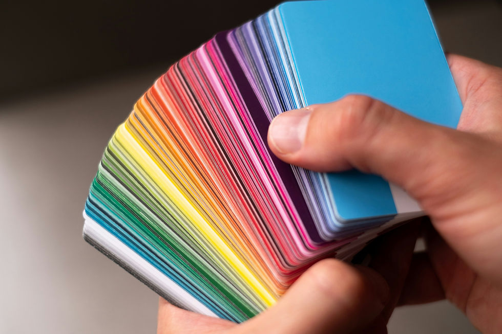
Color researchers are learning what colors motivate us, calm us, excite us, even which ones encourage us to be more social!
By Lynne Kornecki, Publisher
A recent article in the Wall Street Journal on 4/14/25 reporting how color boosts productivity in the workplace caught my eye and got me thinking. I started wondering about the wall colors artists surround themselves with in their studios.
Many artists I’ve spoken with over the last decade often carve out a studio from wherever they can find the extra space within their domicile. This might be a guest bedroom, a corner in the basement, part of their dining room, even their garage! And finding the space for organizing all those necessary art supplies working artists need? Well, that's another article altogether! But, for now, let’s look at color and productivity as presented by writer Brett Berk in that recent WSJ story…
Employers are revisiting the workplace environment as employees return to work, and that means eyeing its décor and color schemes. They are applying research about the impact of color on human psychology. Evidently, while working at home, employees grew accustomed to being surrounded by the colors of their own home-- reflective of their individual personalities.
As an artist, are you surrounding your studio workspace with colors that impact your psyche’? Or boost your own creative productivity?
Blues, browns, and greens were often used within workspaces as a way to set the tone for employee health and well-being.
According to the WSJ article, saturated colors have the capacity to change our respiration, our blood pressure and even our body temperature as quoted by Joseph White, director of design strategy for MillerKnoll, the world’s largest office furnishings company.
A recent color response study showed that when participants were placed in a pale blue or pale-yellow room, they showed lower heart rates and were more relaxed. Those placed in vivid yellow or vivid blue rooms demonstrated higher reading comprehension scores. Who knew?!
MillerKnoll generated its own template for best use of color. They found that soothing colors such as sage green inspire reflection and warm colors like oranges or yellows encourage socialization. Solo workspaces needed to avoid red which erodes analytical performance.
Artists usually LOVE color and freely spread that love generously over their canvasses. However, maybe you should consider spreading that same love to the walls surrounding your studio workspace. It just might boost your own productivity and make studio time even more enjoyable, and ultimately profitable. It’s definitely worth a try!


